Symbols, Bathrooms, Flags & Languages
Table of Contents
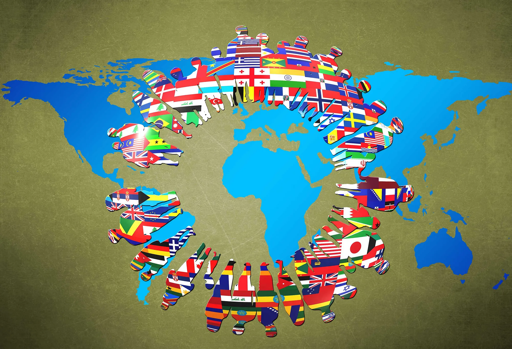
Flags do not represent languages. They represent countries, histories and so much more.
Ever enter the wrong public bathroom by accident? Did your experience have anything to do with how the door was labeled?
The next time you find yourself in a public place and need to use the restroom, take a moment (if it’s not too urgent) and note the indications on the doors. Many locations use the words Men and Women, taking all the mystery out of your decision-making process. But some places like to be ….creative in labeling the bathroom doors. Sometimes the symbols are clear, while other times…not so much. In one location, images of James Dean and Marilyn Monroe were used on the door. I suppose that represents Men and Women Do Your Business Here, and not Dead Famous People Hide Out Here.
In one location, I actually saw a rooster and hen as the bathroom symbols. That sure assumes that the user can discern between the two, and has had some previous experience with them.
In fact, the UX Myths website talks about the usefulness of icons and notes that
“A user’s understanding of an icon is based on previous experience.”
So when we use symbols that are recognizable, we must be certain that we understand what they really represent. And, of course, we must be sure that they are universally recognizable.

Flag ≠ Language
Take the example of country flags in website language selectors:
You go to a website, and it is in a language you do not know. So, the first thing you want to do is discover how to change the language to something you know. So, you look around on the screen — probably in the top-right corner — and you spot it…. The “language switcher”. You are looking for the option to change the language to English, and there you see it, perhaps in a drop down menu — the word English. And, what is that little image to the left of the word English? Why, it’s a flag — a United States flag. “That’s great” you think, as you are navigating the website from your office in Canada. Where you live. Where you are from.
Good thing you recognize the U.S. flag, because that is the only country which speaks English in the world.
You visit the same website, but this time you are automatically directed to the English version of the website. Because the web developer, in their infinite wisdom and analysis of user statistics in your country (Canada) decided that their multi-lingual website should just save you the time and frustration of looking for the language you want. So it redirects you to English, since you live in Canada. However, you live in Quebec, and you speak French. And the stupid website keeps redirecting you to English.
Great user experience, right? You can have whatever you like, as long as you choose this one.

Plant the Flag
So, you have been to (or perhaps designed) a website in multiple languages, and have seen each language alongside the language name. (Or far worse, there is only a flag!) What did you think/feel?
Perhaps you felt identified, because your language happens to use the flag of the country you are from.
Maybe you felt a bit strange that your language shows a different flag (I speak that language, but I don’t fly that flag).
It is possible that you are offended by the use of a flag that not only does not represent you, but perhaps represents something opposed to what you are.
Let’s briefly consider each point now.
Identified By the Flag
Congratulations! You are from England. You live in England. You have been a fan of Manchester City all your life. And now, you have the fortune to visit a website that uses the name of your language and your flag in the language switcher. That’s wonderful. But, how many other people don’t have that luck? Let’s imagine the case of England, as mentioned in James Offer’s Why flags do not represent languages. He states that,
“…the flag of England is the most appropriate flag to represent the English language. But how recognizable is the English flag?”
Completely true. So, after all the English language originated, to a certain degree, from ….England. But it needs to be more recognizable, right?
Hey, That’s Not My Flag! (But I speak that stuff)
OK, what flag is more recognizable than the United States flag, right? Consider that, according to Offer, “while the USA has far more English speakers than Britain, English does not originate from the United States.”
Oh, and since you are from England, there is the possibility that you learned in your history class that the U.S. were “the colonies that got away.” Maybe you even feel bothered about it, and their silly “American” accents.
Good point? So, if you are from England, your flag isn’t a good idea because it isn’t so recognizable. And a U.S. flag isn’t so representative. But, it could be worse — let’s fly the Union Jack!
I Hate That Flag!
So, since the flags of England and the United States don’t serve very well to accompany the word English in our language selector, let’s try the Union Jack. There’s a big problem with that, however. Let’s imagine you are a former colony of England/Great Britain/whatever. You surely aren’t going to be pleased to see the flag of the “former masters” as representative of your current language, right?
In closing, as so many others have said before me: flags represent countries, not languages. So unless you are targeting countries, do not use their flags (No matter what the WPML plugin for WordPress suggests!).
So What’s a Girl/Boy/Other To Do?
That, my friend, is a really good question. The simplest answer, of course, would be to not use any country’s flag. Nobody is confused, nobody is offended, and — in the case of websites with many, many languages — there are fewer design concerns regarding how to display them all.
Simple, right?
However, in looking into the issue of Flags vs. No Flags, I came across an interesting article that seemed to buck the trend of “Flags-For-Languages-Are-Evil” opinions. Andrey Mima, in the article, Using flag in language selector is still okay, acknowledges that flags really aren’t a good combination for languages in a selector. He continues by showing a screenshot of Twitter’s homepage, with the text completely displayed using Chinese characters. The argument is that
“How do you find the language selector in order to switch the language? You can’t. And flags don’t match languages, so there are no flags.”
OK, good point. If you can’t find the language switcher, you can’t switch the language. But, this only shows that a language switcher needs some sort of visual representation to draw attention to it. This doesn’t necessarily mean it should be a country’s flag. So, what other options are there?
A Flag by Any Other Name…
The great minds behind international language standards and design (who are far more intelligent that I am) came up with a possible icon to use in such situations.

It’s a ….nice icon, but just doesn’t seem to get the job done for me. I see what it is trying to represent, but I think that the icon is just too detailed to be useful, especially at smaller sizes.
Let’s try something else: the famous globe icon:

I can think of two reasons immediately why this icon might not be such a good idea:
- The globe icon suspiciously sets North America at the center of the icon. We know the rest of the world must be on the other side….we just can’t see them. (They aren’t as important?)
- It looks similar to the Facebook notifications icon. Normally what one website decides to use for a notifications icon doesn’t make much difference, but Facebook is no ordinary website…
So the globe icon could be easily misunderstood and, like the flag icon, could also be offensive.
OK, so since I am so talented in explaining what doesn’t work, what do I suggest?
Since most website visitors are now accustomed to seeing a flag alongside the language name, why not keep the flag idea? But, instead of showing a specific country’s flag for each language, why not just show a generic flag icon?

It is non-specific, non-offensive, and already a familiar icon to use for languages? There are several possibilities; I am showing the Font Awesome version here simply because it is more recognizable.
What are your thoughts?